#HowsMyFlattening? Group led by U of T community members creates one-stop shop for COVID-19 data

Published: April 14, 2020
There is no shortage of information and news stories about the novel coronavirus. But in mid-March, as the outbreak in Canada was starting to accelerate, Dr. Ben Fine, a physician-scientist with Trillium Health Partners, began to worry there was too much information coming from too many sources.
He wanted to help Ontario government and health-care leaders – and the general public – by identifying the most useful data and collecting it in one place.
“There was no way that any one person – and certainly not a busy decision-maker – could make sense of what was going on here,” Fine says. “COVID was moving fast and we needed to move faster.”
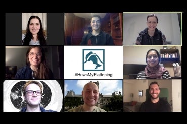
Fine, who completed his MD at the University of Toronto and has affiliations with U of T’s Centre for Healthcare Engineering and the Creative Destruction Lab at the Rotman School of Management, reached out to colleagues, graduate students and recent alumni in computer science, engineering, health informatics and epidemiology. Over several days in mid-March, members of the group built #HowsMyFlattening – a one-stop-shop for coronavirus data in Ontario. (The name refers to the goal of “flattening” the growth trajectory of the outbreak.)
Fine says the website accomplishes three things: It gathers all of the most relevant data for Ontario in one place; it uses data visualizations to explain why flattening the epidemiological curve is so important; and it creates a virtual team of experts to collaborate and share ideas on how to slow – and eventually stop – the outbreak in the province.
More than 150 people, including many from U of T, have volunteered to work on the site. Every day, members of the group collect data about Ontario’s coronavirus cases, analyze the numbers, design data visualizations and decide what will go on the website.
With so many people, the work proceeds quickly, says Farbod Abolhassani, a U of T grad and analytics consultant for Medtronic Canada who is volunteering for #HowsMyFlattening. Posting new information to the site every day is crucial in a fast-moving pandemic, says Abolhassani, but the team is careful not to let speed get in the way of accuracy. Analytics posted to the site are checked by the group’s expert advisers.
One information gap the group identified almost immediately: Ontario’s outbreak was changing over time. The province was posting the number of cases and tests on its website daily, but deleting the previous day’s information at the same time. “It’s impossible to tell what’s going on if you have just a snapshot in time,” says Fine.
#HowsMyFlattening, by contrast, shows how the number of cases and tests has changed in Ontario almost every day since March 28.
The site also breaks out cases in Ontario and health-care capacity by region, which is useful for patients who want to know if the closest hospital has the space and equipment to care for them.
“It doesn’t help if Ontario has enough ventilators, but the hospital near you doesn’t,” says Fine. “The question is how many ventilators and intensive care beds do we have left. Our bottleneck is intensive-care capacity. That is what will kill people.”

(image via #HowsMyFlattening)
Since its launch on March 21, the site has received about 15,000 visits and 500 people have signed up for its newsletter.
“#HowsMyFlattening is the first website I look at every day since it quickly gives me a snapshot of how our province is doing,” says Vivek Goel, U of T’s vice-president, research and innovation, and strategic initiatives, and a professor at the Dalla Lana School of Public Health who is hosting a regular podcast on the outbreak. “While the page is clean and simple, I know there is an incredible amount of work that is required to pull data from multiple sources to create this.”
Team member Laura Rosella, the director of the Population Health Analytics Lab at U of T and an associate professor at the Dalla Lana School of Public Health, says COVID-19 has shown the importance of good data, sound analysis and effective communication.
“This approach requires multiple perspectives to make sure the numbers speak to a wide audience,” says Rosella.
Data collection remains an ongoing challenge, in part because there’s no central source of standardized information.
As the curve begins to flatten, the team will start to analyze the effectiveness of Ontario’s interventions to slow the outbreak. This is important because there will be pressure to ease restrictions as case numbers go down, which in turn could cause infections to rise again.
“We want to know, based on evidence, which interventions are most effective,” says Liam McCoy, a second-year U of T medical student who is volunteering with the site and leading a team to gather and analyze data about the effectiveness of different interventions to stop the spread of COVID-19.
Like other students involved with the project, McCoy says working on #HowsMyFlattening has given him the opportunity to test and develop his skills in a high-pressure, real-world situation. “We’re all learning very quickly about the best ways to work with data,” he says.
Amna Liaqat, a PhD candidate in computer science, appreciates the sense of accomplishment she gets from working on the site. “Very often in academia you spend a long time on a problem that can take years to see an effect in the real world,” she says. “Being able to work on a problem that has immediate real-world benefits is very rewarding.”
Abolhassani says the team, which is looking for funding to sustain the project throughout the pandemic, is still searching for researchers, data scientists, web developers and designers.
“We can always use more help.”


