PhD student illustrates U of T course descriptions with eye-catching posters

(images courtesy of Andrew Chang)
Published: August 1, 2023
When Andrew Chang reads a University of Toronto course description, he sees far more than words on a page.
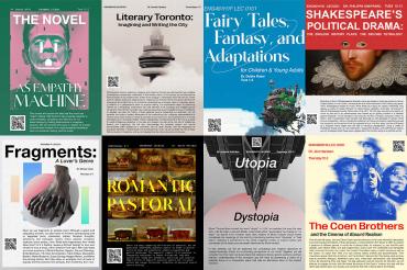
A PhD candidate in the Faculty of Arts & Science’s department of English, Chang is hoping to give students a better picture of what they’re going to learn by designing colourful posters that bring upper-year English course descriptions to life through powerful imagery.
“This project was me trying to bridge the gap between what I think a class can offer and what just words on a page offer,” he says.
Chang, who is working with the English department this summer in a marketing and communications role, was tasked with creating engaging visual displays to help promote advanced studies seminar courses.
He says he used his imagination to create 26 posters that help bring the course descriptions to life.
“These were classes I would want to take if I were an undergrad because they seemed rich and interesting,” Chang says. “But I would understand why students might not want to take them because as words on a page, they might not sound as interesting as your imagination can take them.”

To create the posters, Chang sat down with the course description text on a spreadsheet, wrote down the first image that came to mind for each class and then began searching for what he envisioned.
“In some cases, it’s finding an image that complements the class,” he says. “In other cases, it's taking the class and pushing it in a completely different direction to reach another audience.”
“I find the posters absolutely delightful,” says Associate Professor Alex Eric Hernandez, the associate chair of undergraduate studies in the department of English.
“What I love about them is that each takes the course themes and stated descriptions – which are often highly technical and specialized – and then engages in a playful allusiveness, just letting his artistic imagination freely connect idea and image together.”
One of Chang’s posters promotes the class “The Novel as Empathy Machine,” taught by Professor Audrey Jaffe.
“I looked over her syllabus and noticed she was teaching Frankenstein,” says Chang. “She was also teaching Do Androids Dream of Electric Sheep? So the first thing I thought of was to look at movie posters and book covers.”
One of the book cover images that caught Chang’s eye was a sheep with an electrical outlet as part of its body.
“And then I kept thinking of Frankenstein as this creature who's trying to learn how to sympathize with people. And those images came together. Then a lot of the extra stuff comes from playing around. What colours might be unexpected or fun? What could show up really well on a computer screen or on a wall?”
In a poster for Professor Michael Cobb’s course, “Fragments: A Lover’s Genre,” Chang says he created multiple designs before realizing he needed to change his approach.
“I wasn’t letting the audience make their own interpretation of what this class might be,” he says. “So it came down to abstracting it as much as possible.”
His solution? Taking inspiration from the sculptures of Auguste Rodin.
“Rodin had done pieces of people's hands in various positions,” Chang says. “He had one called Hands of a Pianist. It was two hands laying on top of each other, which is the image I chose. I kept thinking, it's one person's hands, but it looks like two people's hands.
“It's like their two hands are engaged in this intimate, romantic gesture. I loved that it was just their hands, a fragment of their body. That became the central idea.”
With the main image in place, he then worked on the imagery surrounding it.
“I thought, ‘Let's go full digital, and find colours that remind students of social media apps and then let's put a papery texture to bring back the text and paper components.’”
Another one of his favourites is the poster for the “Romantic Pastoral” course taught by Professor Karen Weisman. He started with imagery that evoked a peaceful landscape, noting that landowners and farm owners of the Romantic period were especially proud of their cows and often had portraits made to celebrate them.
“But I kept noticing artists had an overwhelming tendency to draw cows very square and rectangular. And I thought that would be a great print. So I started compiling pictures of cows together into a grid.”
Chang says his creative work on the posters connects to his own PhD research that examines 19th-century British literature and how imperial control over sexuality, ethnicity, race and nationality is enacted through the literature of this era.
“It was a time period where novels and print media in general really became a way for people to connect with each other,” he says.
“It also became a way for people to push forth an idea of what the world was, for better or worse. I've always been fascinated by the idea that reading together or learning something together can unite people and make them see something in a different way.
“And that’s very much in line with this project in that part of my job is to inspire students to see things that are black and white in new ways they might not have expected.”
Hernandez is similarly eager to see whether the posters help forge a deeper connection between professors and students.
“What we hope is that strategies like this ultimately help bridge the gap between our students’ curiosity and the cutting-edge work in which our department’s instructors are engaged,” he says. “The posters are just one way we’re trying to communicate how dynamic literary study can be.”


