U of T classics prof uses graphic design, humour to keep students engaged

Sarah Murray, an associate professor in the department of classics, sports one of her T-shirt designs near Nuxis in southwestern Sardinia, Italy (all photos courtesy of Sarah Murray)
Published: August 23, 2023
“Let not the tyranny of the PowerPoint template reign supreme.”
This declaration appears on the personal website of Sarah Murray, an associate professor in the University of Toronto’s department of classics in the Faculty of Arts & Science.
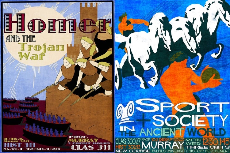
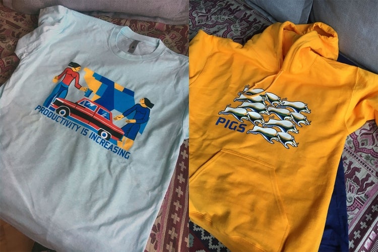
To liven up her lectures when teaching classics like the Iliad and the Odyssey, Murray creates colourful lecture slides and course posters that have become an integral part of her teaching – artwork that she's even begun using on T-shirts and hoodies.
“I find it more fun to teach when the students are having a good time,” she says. “And it seems that engaging visuals do a lot of the work in keeping students focused on the intellectual journey I’m trying to take them on.”
Murray first got into graphic design to make some extra cash as a graduate student at Stanford University.
“I was living in Palo Alto, Calif., which is very expensive,” she says. “The cost of living there is so high that I was always looking for ways to make some money.

“For a while, I was doing the very glamorous work of setting out cheese and wine for receptions following department events. But at some point, a better-paid position for a grad student to do graphic design opened up. I didn't have any experience with graphic design, but I'm generally able to wrangle most computer programs through trial and error. So I told them, ‘I can do it.’ And then I figured it out from there.”
One of her first and favourite posters was created to promote the defence of her dissertation, “Trade Imports & Society in Early Greece: 1300 – 900 B.C.”

In the classrooms where she now teaches, Murray says she can tell if her imagery is engaging students by their chuckles, the number of raised hands or the liveliness of the discussion.
“It's more fun for me, too,” she says. “I don’t take much delight from filling out bullet points in a PowerPoint template and then reciting them in class. On the other hand, it's very satisfying to bring something funny or esthetically pleasing into the world that didn't exist before – so, I enjoy that aspect of it.
“As far as pedagogical utility goes, having some visual jokes in the slide deck keeps students paying attention for two reasons. First, because they think something funny might appear on the screen at any moment. Second, if they actually laugh when they are supposed to, that helps me have a sense of whether people are following along with the lecture content.”
Vintage travel posters are a key source of inspiration, she says. Noted for their vivid colour, posters, print ads and brochures were the most common way for travel companies to reach their customers from the late 1800s until about 1950.
“There's such a rich body of these beautiful posters, which are both fine examples of genuinely excellent design and captivating reminders of a bygone era of travel,” Murray says. “So, my earlier posters would often try to begin from that visual world. Then, I would try to envision what it would look like if, instead of advertising an exotic vacation destination, you were advertising a course about the Odyssey, and let things develop from there through the strange mechanism of the human imagination.”
Another source of inspiration comes from a post-PhD trip to Georgia, where she was struck by the imagery used in Soviet-era propaganda posters. Some stirred patriotism, others slammed illiteracy and laziness, while still others condemned the evils of capitalism and praised socialism.
“It sounds scary, but the Georgian propaganda mosaic artists in particular were incredibly talented,” says Murray. “While a lot of Soviet art was deliberately destroyed after the fall of the USSR, many mosaics have been preserved specifically for the reason that they are genuine masterpieces.
“So I would say that I entered a new phase after the Georgia trip, so that a lot of the post-Stanford designs attempt to capture the spirit of muscular propagandism more than dreamy, aspirational travel. This phase also coincided with a decision to start making my own custom ‘merch’ featuring some of the propaganda themes.”
Having created about 10 different designs for T-shirts and hoodies so far, Murray says the project was an effort to combat boredom during the COVID-19 pandemic.

“My daily routine involved waking up, working, running, working and going back to sleep, which became pretty tedious after a while. So, I started working on these designs in the evening as a way to relax,” Murray says. “It's very different to what I'm doing most of the time, which is reading academic scholarship and trying to compose complicated research arguments. Of course, that’s really engaging and fulfilling in its own way.
“But creating a visual design – it's not so much an intellectual process as an esthetic and imaginative exercise. It helped me sink into a few hours of immersive, pleasant internal productivity. And I genuinely like having my weird bespoke shirts. They make me happy. I wear them all the time.”

Murray will be wearing her designs next year when she’s on sabbatical to focus on her research, which includes being the co-director of the Bays of East Attica Regional Survey Project situated around the bay of Porto Rafti in Greece – an archaeological project that aims to expand scholarly knowledge about the history of this area.
She’ll return to teaching in the fall of 2024 with a new repertoire of posters and slides that are sure to spark laughter, thinking and discussion.
“In some ways I’m being selfish in that I like to make them,” she says. “And I think the material we're studying is really fun. There are a lot of interesting, strange things going on in the ancient world.
“You can play that up in a way that piques curiosity. It's not just that I want the students to pay attention to me in that moment. I want to get them thinking excitedly about the little bits of magic that you can pull out of even old texts.”


